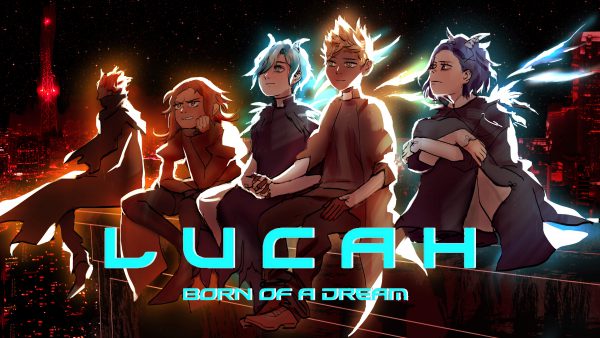
Lucah: Born of a Dream Review
November 28th, 2018
Lucah: Born of a Dream appears to be quite the bit of a “hidden gem” in the action RPG genre.
It’s a game with an admittedly off-putting, but definitely unique aesthetic. While I personally think it adds to the charm of the game and story, it is at times inconsistent and at odds with other interface elements and typefaces presented. It led me to not be as fully immersed in the story as I would have liked to have been, given that the cryptic, abstracted narratives try their hardest to engross the player in its lore. And there’s plenty of it.
The story and expanded narrative are really the focus of the game. The game is of course a top-down action RPG with the tropes you would expect like upgradable combat abilities and combos, swappable item pick-ups, and leveling; but I feel like it is really just a way to progress the story, more than the other way around. That’s not to say that these things were not enjoyable; in fact, they are presented in a fairly unique way to provide not only a tie-in to the lore, but also an amazing level of character and gameplay customization.
Speaking of the combat; it is serviceable. I felt like there may be some issues with collisions in some areas where your attacks hit the sides of walls instead of the enemies. This issue is compounded by there not being enough visual clarity on attacks. You are sometimes left not really understanding why something missed or if it actually did hit the enemy in the end. This was somewhat uncommon, but it did put a damper on the great amount of customization you have over the combat by building your character and attacks in different ways.
The narrative is at this game’s core, which led me to scrutinize it deeper than I may have otherwise. I’ll admit that I don’t understand everything after the end and I kind of like that ambiguity and vagueness. I’ve only ran through once (getting what I believe to be a “bad” ending) and read the expanded “New Game +” story. I do have a few nitpicks with the writing itself. The Christian/religious themes seem to be a bit heavy handed and conferred with slanted perception. It’s also weird given that the game has no issue presenting other coded themes and concepts into the dialogue in much more subtle ways. The characters also seem to act in non-believable and non-convincing ways in several instances with a lot of them feeling one-note and samey as each other. The latter may or may not be an explainable phenomenon. It’s a personal point of contention, that again, broke some of that immersion for me.
The exploration of this impressionistic and at many times, chaotic world feels great. It’s a shame that the mapping system is not there to support this. The map feels disjointed with connecting pieces that don’t actually connect and leads to much confusion, especially when exploring areas for the first time. It’s perhaps even intentional, but if that is the case, then I think there are much better ways to deliver this idea.
While my criticisms are many, I hope to emphasize that this is a great game, brought just a bit lower than what could be with a few tweaks here and there. These are nitpicks.
The game is really good and overall, a great experience!


Leave a Reply