Olympic Logos

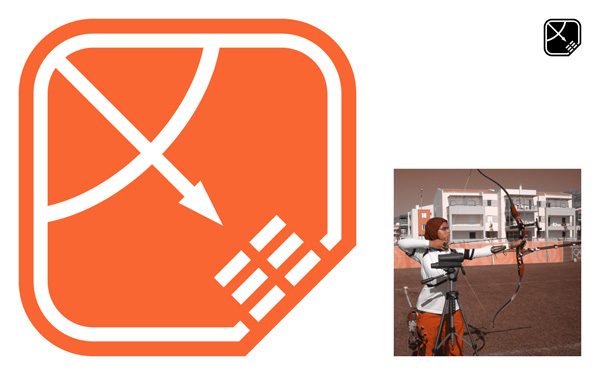
Archery Logo & Mood Board
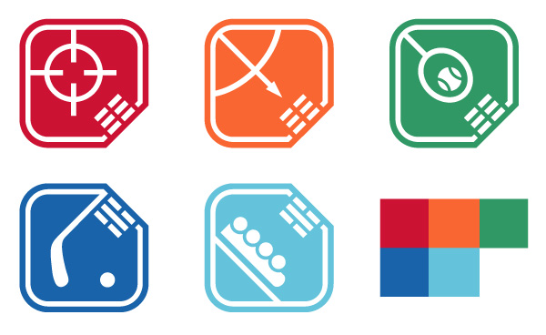
This school assigned project involved creating a set of five different logos representing five different sports from the olympic games. My concept was to set the olympic games in South Korea, using both summer and winter design experimentation.

Complete Set of the Five Logos
In the South Korean flag, there are symbols that mean different things. For example, the symbol : : : stands for field; earth, summer, west, justice. This is why it appears on my summer game logos, in the west corner (Tennis, Archery, Shooting). The : | : symbol stands for gorge; moon, winter, north, knowledge or wisdom. Again, this is why it is placed in the north corner for my winter game logos (Hockey, Bobsledding). Appropriate colors were also used to represent the “feeling” of the sport.

South Korean Flag Comparison
I wanted to keep the logos very simple; therefore, more bold and more iconic. A fitting theme considering the large political history of South Korea and Korea in general.

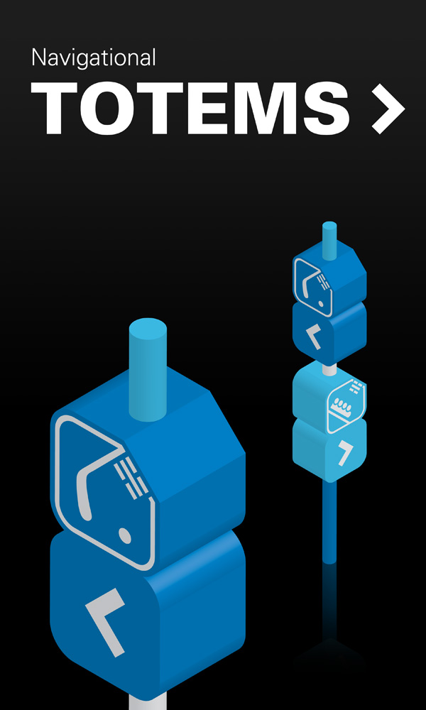
Navigational Totem Application
The other requirement for this project was to create two enviromental applications for the logos, shown above and below.

First-Aid Kit Application
Project completed in 2007. All content created with Adobe Illustrator.
